
Plant genomes: from data to discovery EBI Virtual Course
Session 2: Experiments, Datasets, other Data Resources and Groups
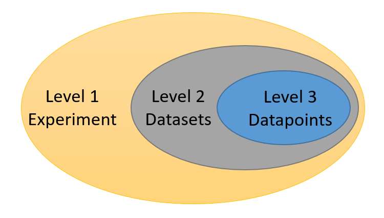
Germinate can hold large amounts of experimental data (millions of data points). These can include data from phenotypic trials, genotypic SNP (or other indexed polymorphism) data, chemical compound information and climate measurements. Germinate currently supports 3 levels of granularity for data. Individual data points (level 3) make up datasets (level 2). Datasets are assigned to experiments (level 1). So an experiment contains one more more datasets and a dataset contains one or more data points. Figure 1 shows the hierarchy of data levels in Germinate.
Go to https://germinate.hutton.ac.uk/demo to follow along with this material.
Experiments are the overarching level of granularity. A dataset can only be assigned to one dataset. Experiments are accessed by clicking on the Data then Experiments menu item on the left hand side Germinate menu.
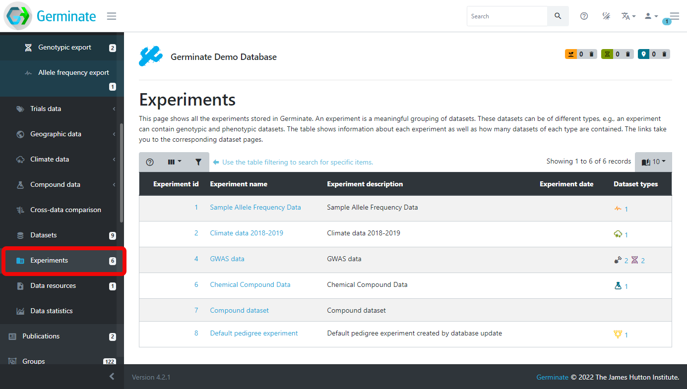
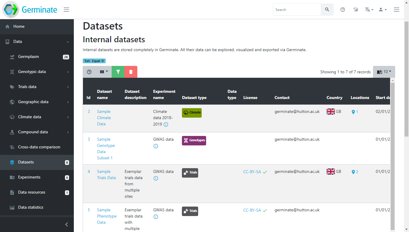
Using the Germinate Demo database we can see that there are 6 different experiments we have access to. If you look closely under the Dataset types column you will see that some of them have icons and numbers. The icons shows particular data types; climate, field trials, genotype and chemical compound data types. The number next to each icon shows the number of datasets in the experiment of that type. Take for example the GWAS data experiment which has an Experiment id of 4. This has 2 field trial and 2 genotype datasets contained within its experiment container. If you are not sure what each icon represents just hover your mouse over it and the description will be displayed in a popup.
Datasets allow experimental data recorded at the same time to be grouped together. An example would be all the trials data for a specific site in a specific year. An experiment allows the grouping of datasets into a logical unit so for example, all the trials data across multiple sites and years. These grouping allow data which is logically related to one another to be grouped together for easy searching and analysis.
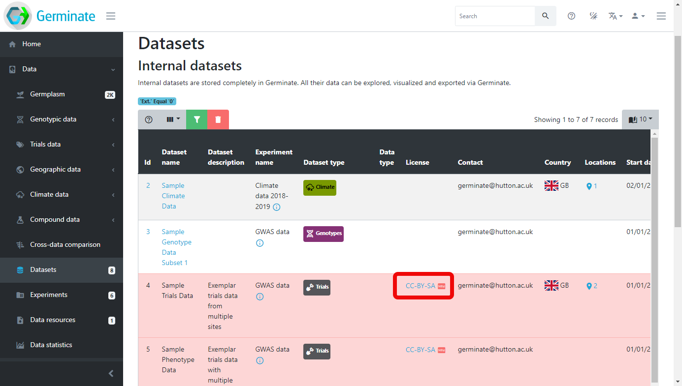
Datasets are the smallest grouping of data in Germinate and represent a single unit of data like a single field trial. The datasets page which can be accessed by selecting Data then Datasets from the left hand menu shows all datasets stored in Germinate. The icon buttons at the right side of the table will reveal information about collaborators, dataset attributes and download options (you may need to scroll horizontally to see these). Clicking on the dataset name in the table will take you to the corresponding data export pages.
Experiments group together coherent datasets into meaningful combinations. This way, field trials data can be linked to the corresponding climate data as well as any genotypic data that is linked to it. The dataset type column shows what types of datasets are contained in this experiment.
Click on the ‘GWAS data’ dataset with the Experiment id of 4. Something is up it wont work….
When you look at the Datasets page you may notice that some entries are highlighted (in this case in red). This shows where a data licence has been applied to dataset. Germinate supports assigning licences to datasets. These licences are user defined when the dataset is submitted and can be as restrictive or open as required. All data in the demo database for example is released under a CC-BY-NC licence to promote the data use in other projects. To get additional information on Creative Commons licences have a look at https://creativecommons.org and while other licence are available, and indeed may be more appropriate for your data this is a good starting point.
In order to access the data contained within a dataset that has a licence assigned to it you need to agree to the terms of the licence. To do that you need to click on the licence name within the Licence column in the Datasets table. When you do this you will see the licence text (see figure x) and you need to click on Accept to view the dataset. Please make sure to read this licence text if you are using someone elses data as it may contain conditions to the use of the data. Commonly seen restrictions include citing a paper where the data was published or acknowledging the funding source that paid for the generation of the data.
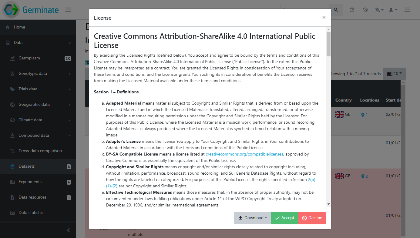
You will see that once you accept the licence all datasets that are assigned the same licence will now be accessible and the red colouring is removed indicating you can now freely access the data.
If you are logged into Germinate the licences you have accepted are remembered between sessions.
If you are not logged into Germinate you will need to accept any data licences next time you use the platform.
Datasets can have additional metadata associated with them. This ensures that any additional information that is relevant to a dataset can be associated with it. Germinate currently supports Dublin Core metadata for datasets. Information from collaborators to where the dataset is from can be stored when data is submitted to Germinate.
Exporting data from datasets
Click on the ‘GWAS data’ dataset with the Experiment id of 4. It should work this time :-)
Lets export some data and look at the options that are available in Germinate. You should now see something like this:
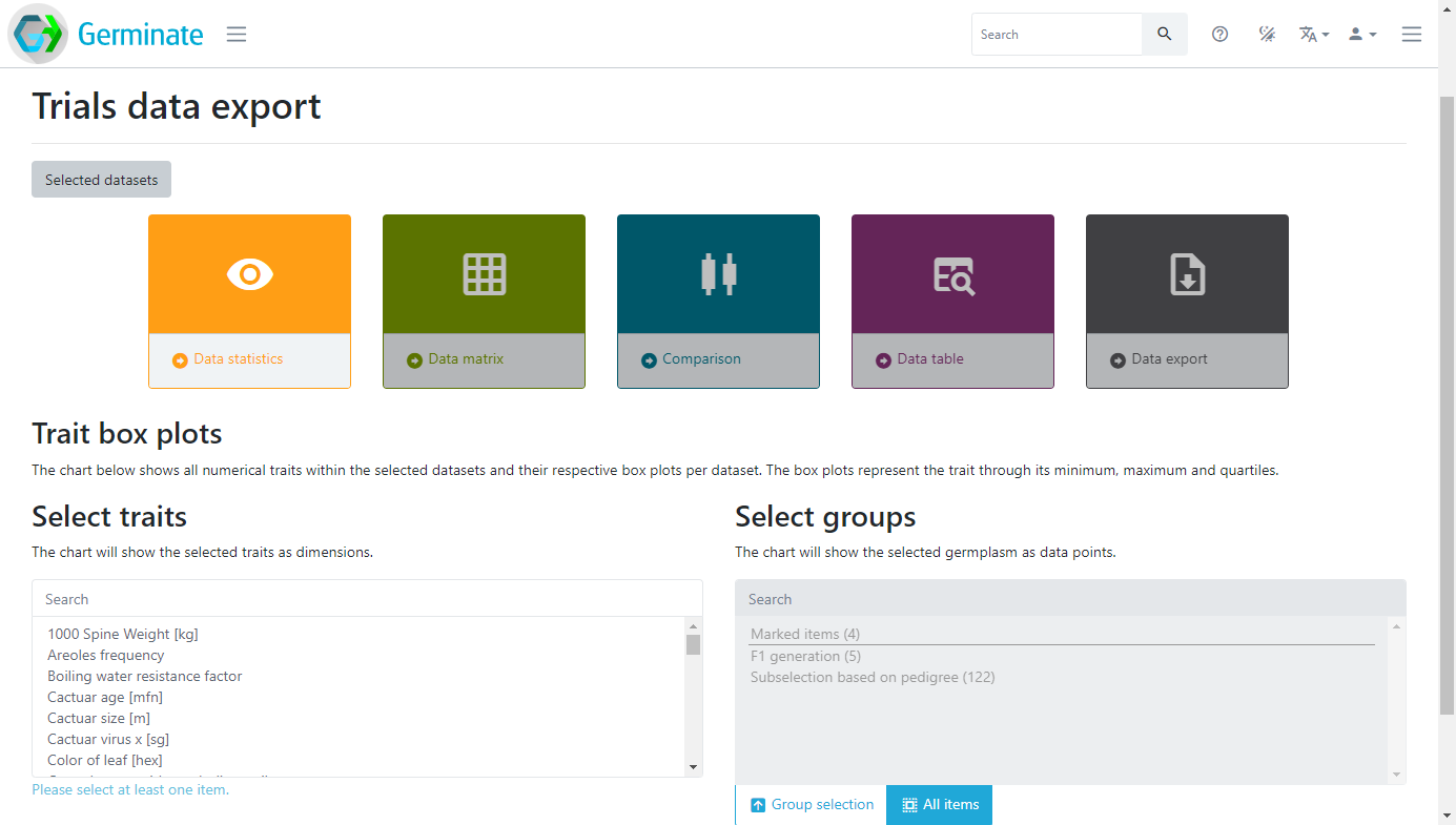
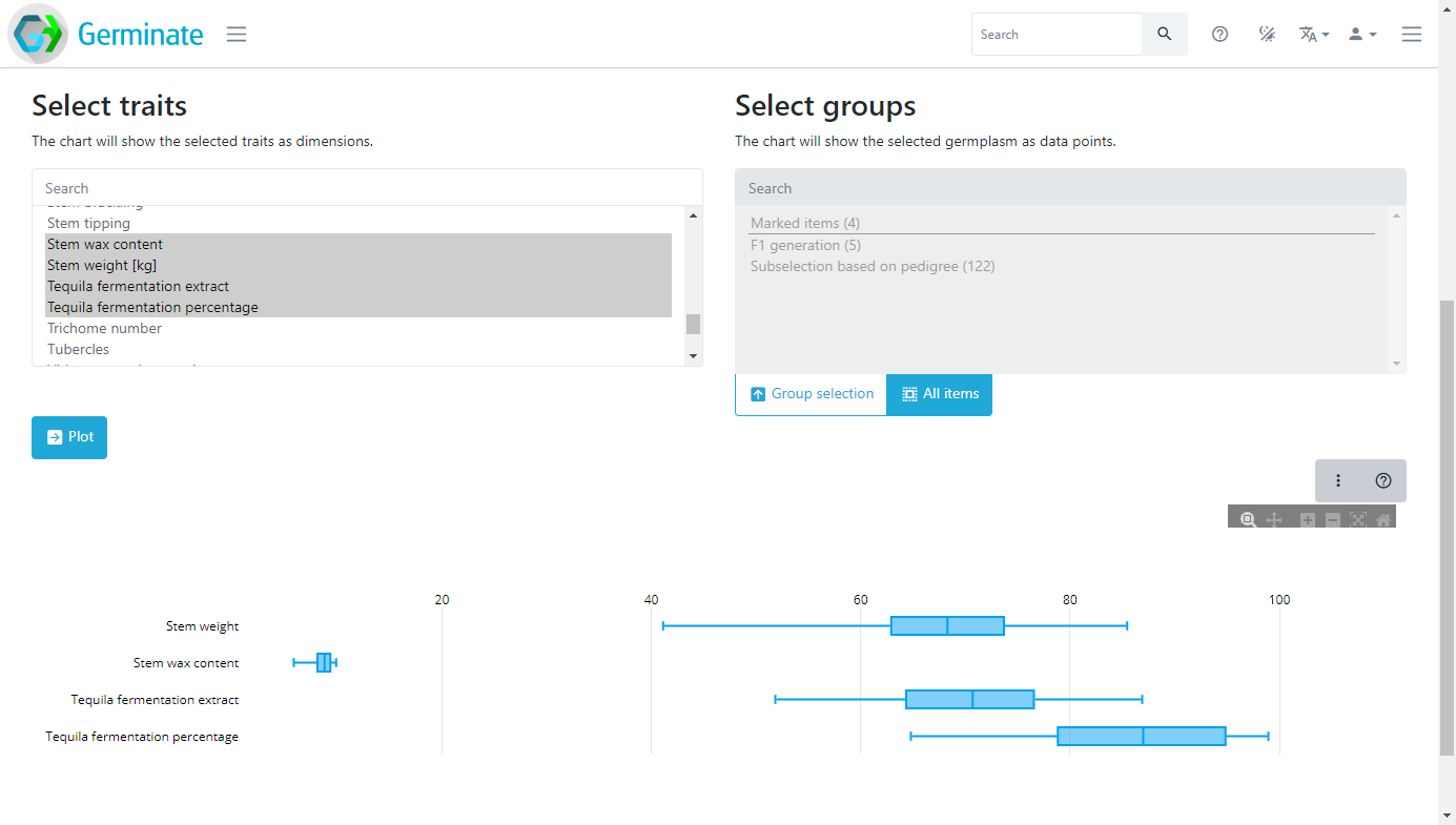
The coloured boxes show the different data visualization and data export options that are available for this dataset. There are also selection mechanisms to choose traits of interest and also to choose which groups you want to export data from. Groups will be covered later in this material but it is a way to allow subsets of large germplasm collections to be created and used to export data against. You only get data for germplasm entries that you are actually interested in. Here we are going to select only the traits highlighted in grey, and we won’t use a specific group in this case. Choose some traits, then finally click on Plot. Germinate will now go and perform some basic calculations to generate box plots for those traits across all germplasm entries within the selected dataset. Hover your mouse over the chart to show additional information.
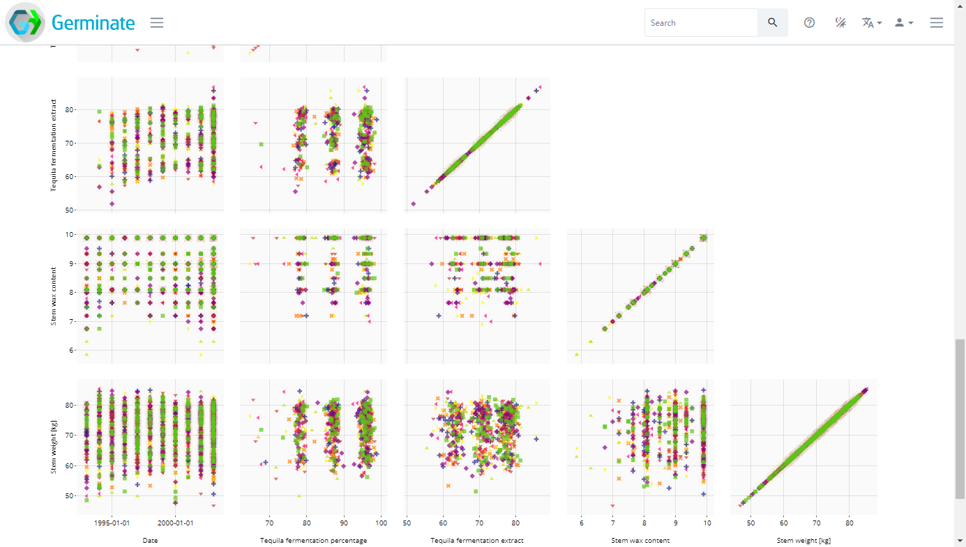
 Now click on the Data matrix option and select the traits again then click on Plot which will generate a matrix of scatter plots as shown here. Try hovering your mouse pointer over points to see what additional information is displayed.
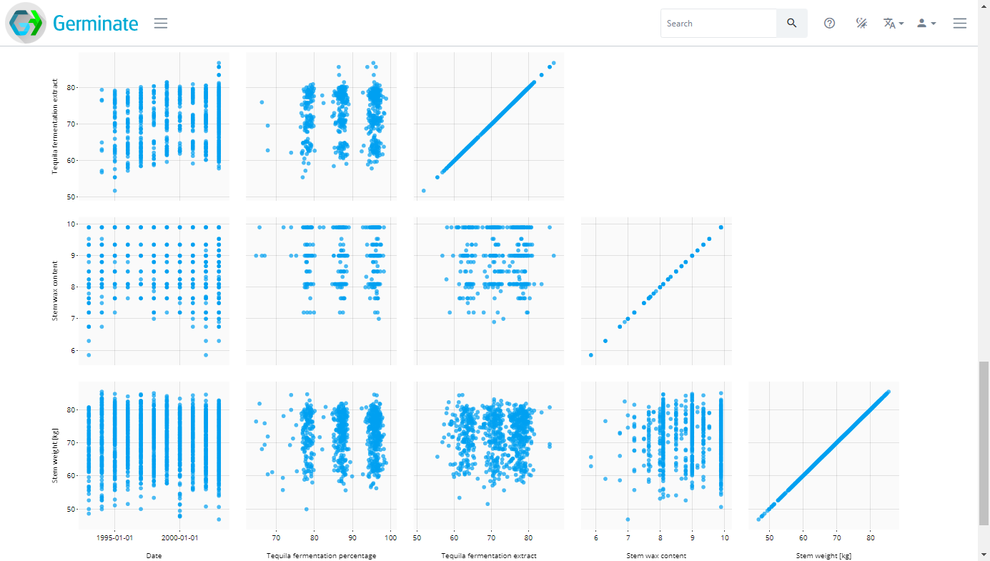
These charts are very informative but we can improve by introducing colour. In the Colour by section which is just above the chart select the Location or Trial site option in the drop down box.
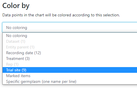
This will then colour the matrix by the trial sites which underly the data. Not all data will have trial sites but in this case we have a few sites from Scotland. Colouring allows you to visualize differences in the data easily.
Cilck on the location name in the plot legend to turn on and off the data series.
The final dataset visualization that we will show here is the Comparison tool which allows us to compare lines within a line group to be compared using boxplots. Boxplots allow us to visualize the spread of data. Single phenotypes can be selected then the charts redrawn. This tools is very effective in looking across germplasm within a group looking for lines with high or low values as well as identifying lines where data may be inaccurate or have unusual outliers (very high or very low values). Click the Comparison option then select a single trait this time, now choose a group (this is a new step required for the Comparison option) then click on Compare and a chart similar to this will be generated.
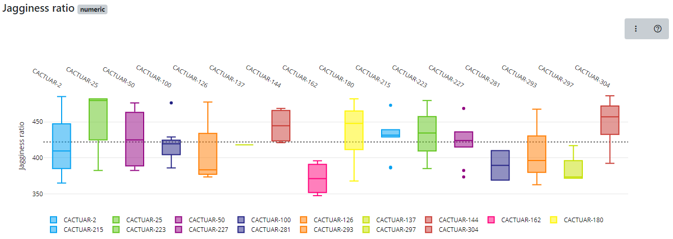
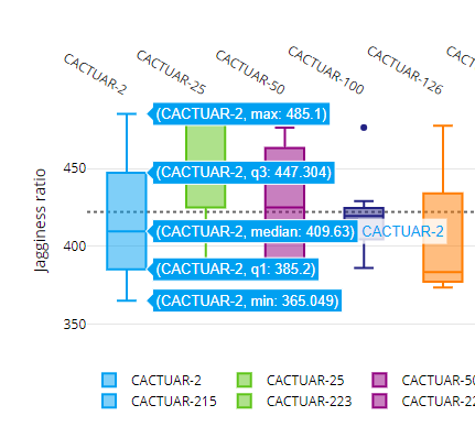
The charts are interactive so if you hover over a boxplot the charts will show the maximum value, median value and minimum value along with the first and third quartile values. Our boxplot visualization can also be exported into bitmap or vector based formats for use in presentations or publications as well as tools to allow colours to be changed and allowing users to download the underlying data used to generate the chart.
Additional information on how to interpret boxplots can be found here. Have a play about with the boxplot feature and explore the options that it gives you in providing an overview of a trait held in the database.
Finally, all data from datasets can be exported in text format. We offer an interface that allows users to select data to be exported. To see how this works select the Data export option then select your traits of interest then click on Export. A plain text file containing the data will then be downloaded to your computer.
Tasks:
-
How many datasets are available in Germinate?
Answer: There are 7 datasets available in the demo version of Germinate. -
Of the datasets how many are genotypic datasets?
Answer: There are 2 genotypic datasets. -
Select datasets with the ID of 5 and then select the 'Ear height' and 'Ear length' traits. Plot this data. What is the median 'Ear height' in this dataset?
Answer: 138.65 -
Using dataset ID 5 again plot the same data as in Q3 but this time use the 'Data matrix' option to determine the plant with the largest ear length and the plant with the largest ear height.
Answer: ear length = CACTUAR-1869, ear height = CACTUAR-1058. Also note that when plotting only 2 traits this representation shows a density estimate of the data points too.
Working with Groups (If you have time)
So far we have been looking at data for the whole set of germplasm and all markers. In many cases, people do not want to download all available data, but only a specific subset of interest. To facilitate this, Germinate uses the mechanism of groups and lists. These groupings are used to define meaningful subsets of germplasm, markers and locations. Groups are persistantly stored subsets of data while lists are available just to yourself.
Groups and lists are particularly useful when exporting data. As an example from the Crop Wild Relatives project funded by the Crop Trust, all germplasm collected in the wild can be grouped together to simplify the export of phenotypic and genotypic data restricted to CWRs. The example below shows the Germinate Chickpea database with a pre-defined group called ‘Wild Cicer Conserved in Genebank’. Using this group will only export data related to the germplasm in the group. This is for chickpea but one of the benefits of Germinate is all databases look the same and have the same features. You can have a look yourself by going to the Germinate hompage then selecting chickpea form the databases or by following this link https://germinate.hutton.ac.uk/cwr/chickpea - give it a go and have a look at one of our other Germinate databases!
Click on ‘Groups’ from the left hand menu then ‘Wild Cicer Conserved in Genebanks’ to see a list of chickpea accessions held in genebanks from the CWR project.
Use your Germinate bookmark from the previous session or to go https://germinate.hutton.ac.uk/demo to follow along with this material.
Lets jump back to the Germinate demo database and continue looking at groups now.
Anyone can create a list of germplasm in Germinate. One way is to use the table filtering mechanism. In the example below, we have filtered the germplasm table by country and searched for mexico. The resulting table shows 93 germplasm from Mexico. You can then add individual germplasm to your current list by ticking the checkboxes on the very right of the table (you may have to scroll across) or by using the dropdown menu in the last table header and selecting “Mark all”. The number in the top right of the table (5 in this case) shows how many germplasm are currently on your list.

Similarly, when exploring data visually using charts, you can use the chart selection options found in the top right of any chart and select either Box Select or Lasso Select where available.
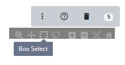
Then draw a shape around the data points you wish to select.
Go to ‘Data’ then ‘Trials data’ then ‘Trials export’ then select dataset with the ID of 5. Then cilck in ‘Data Matrix’ and plot for Ear Height, Ear number per plant and Ear Length. Now colour the chart based on ‘Treatment’.
Use the rectangle (Box) selection tool from the chart options at the top right of the chart to draw around a group of the data points. The number of selected germplasm in this area is highlighted in the blue ellipse in the top right of the chart (there should be a hundred or so but it really depends on how big your rectangle was and which cell in the scatter matrix you chose). Now add the selection to your current list by using the additional chart options represented by the dropdown menu with the three vertical dots and select ‘Mark selected items’.
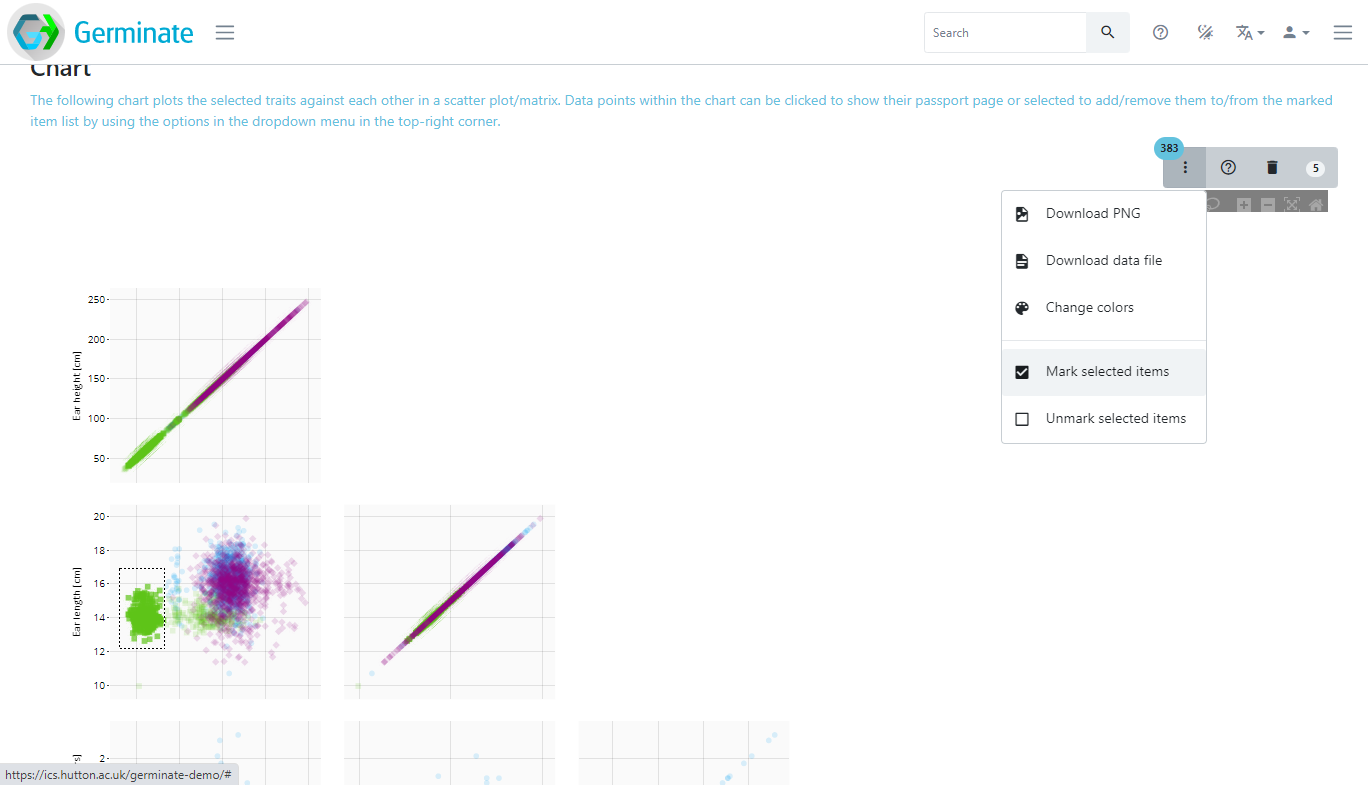
You can see the content of your list at any time by clicking on the respective marked item button in the top right corner of Germinate. In this case you can see that we have 387 germplasm entries, 796 genetic markers and 0 locations in our group but yours will probably be slightly different.

If you click on one of the numbers it will take you to a page showing all items currently on your list. You can switch between the germplasm, marker and location list above the table. In this case clicking on a germplasm item will then take you to the relevant plant passport page for the germplasm item.

We will use groups in the next couple of tutorials where we will look at exporting genotypic and phenotypic data from Germinate.
Tasks:
-
Go to the groups page. How many maps groups are there?
Answer: There are 2 germplasm groups, 3 marker groups and 116 location groups. -
Select the germplasm groups then choose the one named 'F1 generation'. Explore the information that is available for one of the plants.
You should be able to access all the background data we have on each line on these pages. They contain a lot of information sometimes so explore and remember that data is always in the same order - in every Germinate database. -
Go to dataset with the ID of 5. Now plot ear length against ear height using the data matrix option. Now limit this to just the 'Subselection based on pedigree' group. Colour based on 'treatment'. What is the plant line with the largest 'ear length' value?
Answer: CACTUAR-1930 -
Now using the chart from 3. create a group with all lines where 'ear height' is above 200. How many are there?
Answer: 3
These are simple examples but will give you an appreciation on how groups can be created. The best way to see how groups works is to experiment, create some and watch that group indicator increase or decrease as you add and remove plant lines.